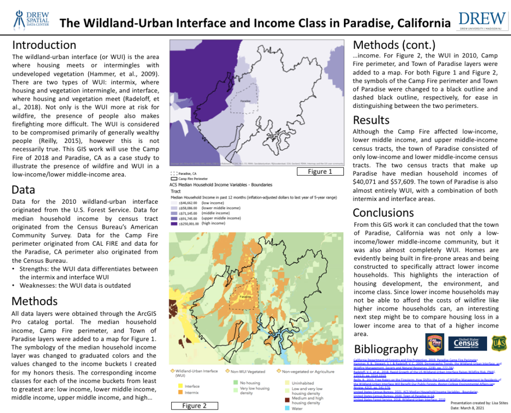
[Assignment 12] Here is a Story Map I made that discusses the interactions between income, the WUI, and wildfire in Paradise, CA.
The Wildland-Urban Interface and Income Class in Paradise, California
[Midterm Project] The wildland-urban interface (or WUI) has been perceived in previous literature to consist of a generally wealthy population. In this project, I use Paradise, California as a case study to prove that this perception is not necessarily true. Due to the WUI’s vulnerability to wildfires, this project has implications for lower income communities within the WUI in terms of resource restrictions for wildfire preparation and rebuilding post-wildfire.
Geocoding My Favorite Pizza Places
[Assignment 10] To make the below map I first made a spreadsheet of my favorite pizza places and their addresses. Then I geocoded those in ArcGIS Online to produce this interactive map. Click on any of the points to see my favorite pizza places and their addresses! 🍕😍 😋
Digitizing Structures at the Horseshoe Lake Park
[Assignment 9] Below is a map in which landmarks on and around the Horseshoe Lake island were digitized. The landmarks include the band shell, pavillion, veterans memorial, gazebo, and bridges.
How Many Schools are Located in Areas of Top Cancer Risk from Air Pollution in NJ?
[Assignment 8] Below is a map that utilizes NATA data to illustrate which New Jersey schools are at the top cancer risk from air pollution. In total, there are 240 schools within this level of risk, however, 158 of these schools are public and 57 are private.
Mapping the Farmers Protests in India
[Assignment 7] Since August of 2020, farmers in India, primarily those from the states of Punjab and Haryana, have been protesting against Prime Minister Narendra Modi’s recent farming laws. Farmers around the country have also been rallying in solidarity. The map below shows all farmers protests around the country between August 2020 and February 2021, along with farmers protests that involved police.
Children Enrolled in Immunization Program 2017-2018 School Year
[Assignment 6] This map depicts data obtained from the NJSHAD website for New Jersey immunization status. Specifically, this map shows the number of enrolled children by county during the 2017-2018 school year. The color transitions from dark purple to light purple in accordance with low enrollment numbers to high enrollment numbers. However, since these are not percents, it should be noted that high enrollment numbers do not necessarily equal high percentage of enrollment. For example, Bergen county has 47,089 children enrolled and a percentage of 94.7%, whereas Cumberland county has 8,675 children enrolled and a percentage of 97.8%. This is likely due to differences in population of children in each county.
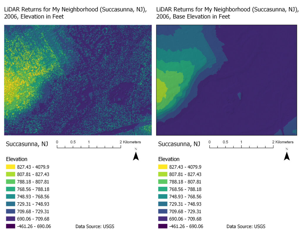
Displaying LiDAR Data
[Assignment 5] The below two maps display LiDAR data, which is very high-resolution elevation data. I chose to display the LiDAR data for part of my neighborhood in Succasunna, NJ (plus the surrounding area based on available data). The left side of these maps are primarily residential housing and the rest is woods, which can explain the differences in elevation.
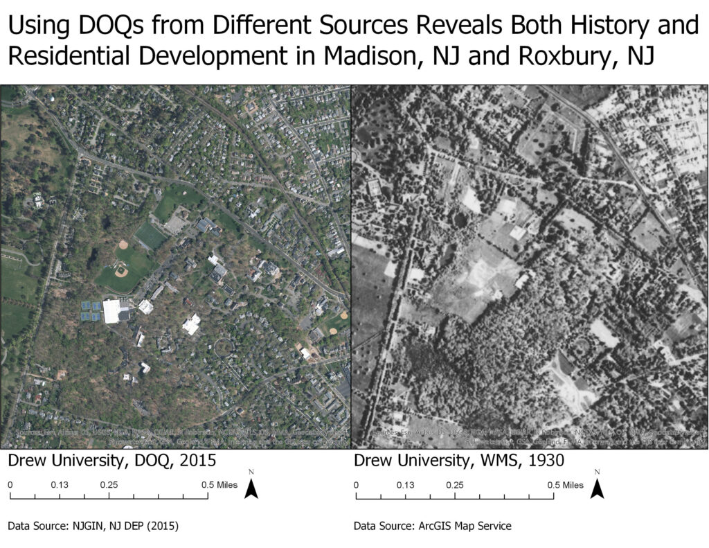
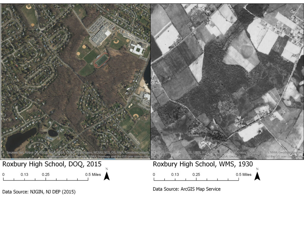
Comparing DOQs from Different Sources
[Assignment 4] Below are 4 maps consisting of two comparative sets. The first set is of Drew University (and surrounding Madison) in 2015 and 1930. The second set is of Roxbury High School (and surrounding Roxbury) in 2015 and 1930. These maps illustrate the use of remote sensing data and aerial imagery, along with changes to landscapes over an 85 year period. A particularly interesting finding I found was that there are two small bodies of water in the bottom left section of the Roxbury High School, DOQ, 2015 image that is not in the corresponding 1930 image.
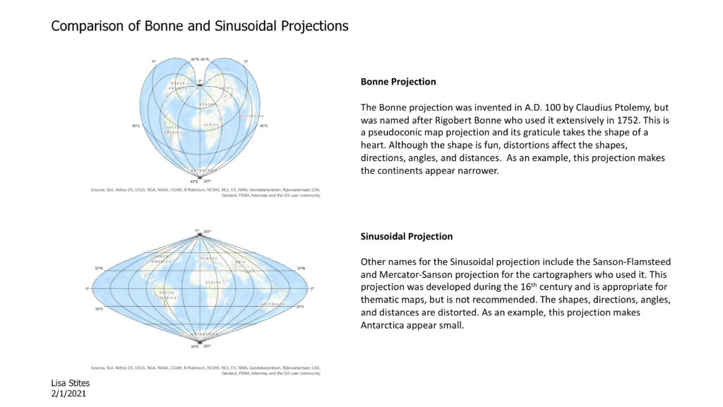
Comparing Different Types of Map Projections
[Assignment 3] This map depicts the Bonne Projection and the Sinusoidal Projection. The purpose of this assignment was to explore the many different types of map projections that exist, along with their history. My favorite is the Bonne Projection because it is shaped like a heart.